We are about a month away from the release of all the 26 OSes and I have been slowly working towards getting my apps ready for the new liquid glass design language. One aspect that has been particularly fun to play with is the new Icon Composer tool. Designing icons has always been one of the hardest parts of app development for me, so I was blown away with how simple this new tool made both updating my old icons and designing a couple new ones!
Wrist Pipe
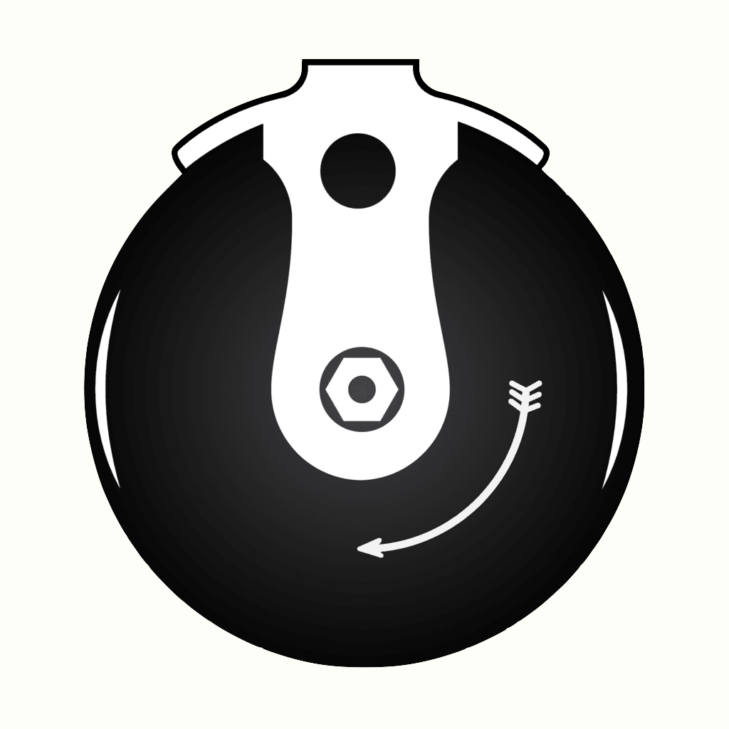

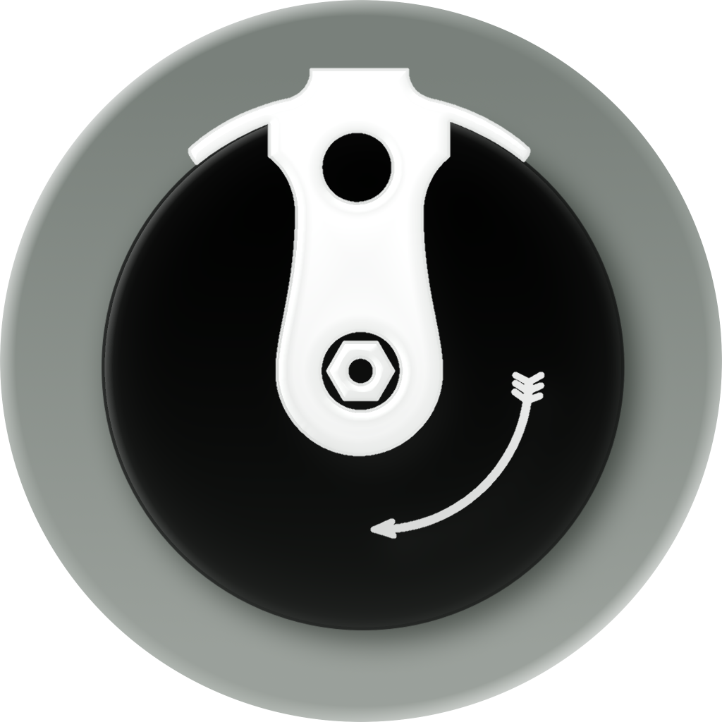
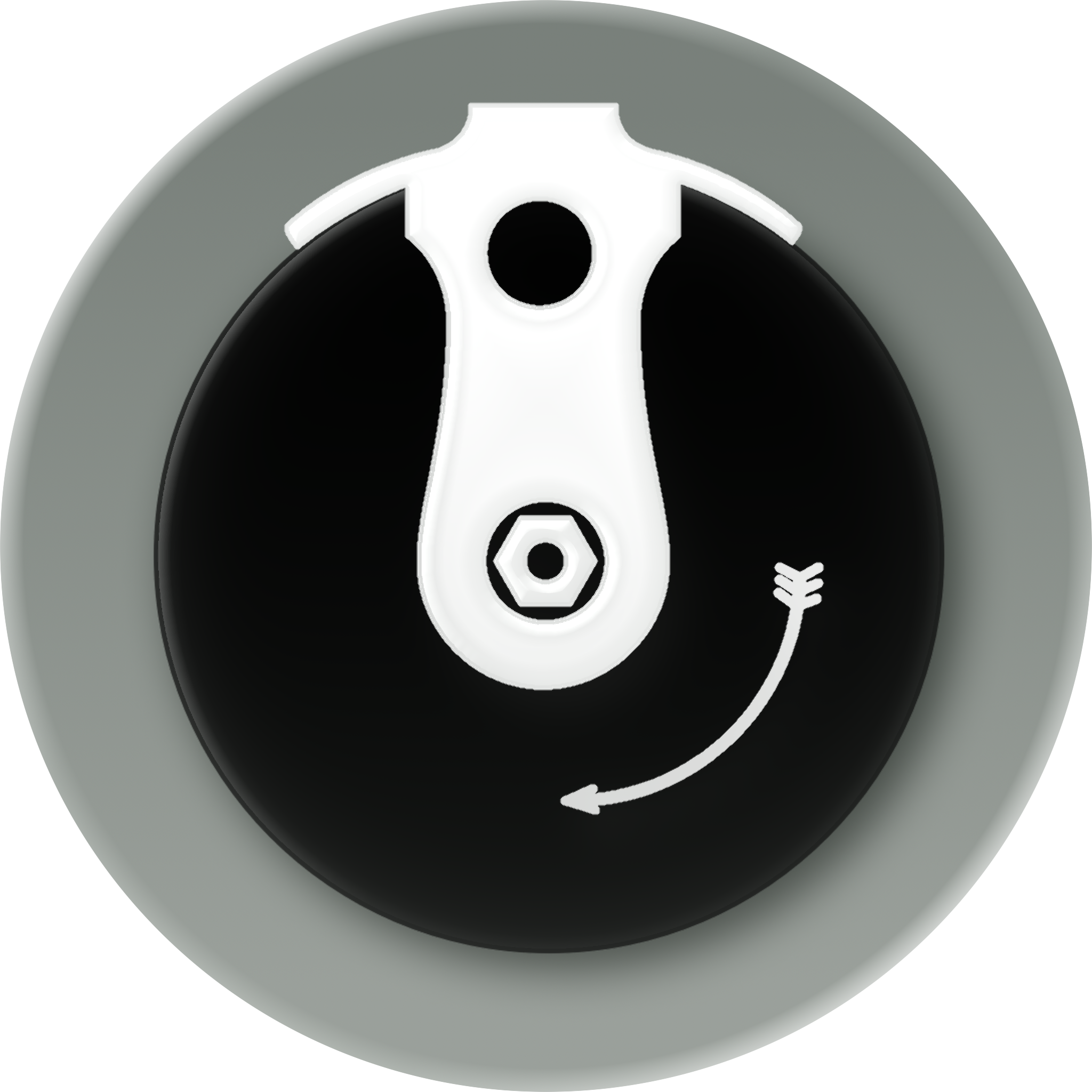
Wrist Pipe just got a new app icon last year that I was very happy with, so I was worried about having to redesign it again so soon.
Fortunately, its design worked really well with the liquid glass style. The glossy edges that were indicated with highlights in the original icon now come for free with the new, glassy materials that make up the layers of the icon. I really like the subtle indication of depth as well. It strikes a good balance between a flat and 3D design.
The trickiest part was the removal of the black outline around the top edge. This removed all contrast with the background, which is why it now has a gray gradient. I don’t know if I’m sold on the exact color yet, but I think it is pretty close.
Scoundrel Solitaire
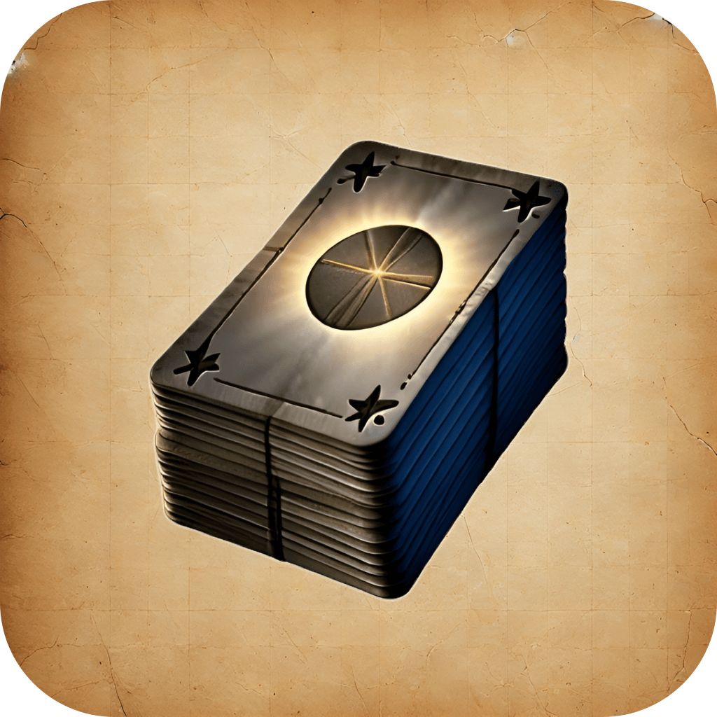

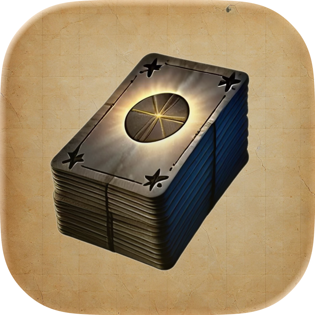
The icon for Scoundrel Solitaire is almost the exact opposite of the one for Wrist Pipe. The more textured design didn’t lend itself to a truly glassy look in the same way.
I was surprised how well Icon Composer handled this type of icon, though. It was able to take in the images that make up the icon and tweak them just enough to fit in with the new design language without requiring an entire redesign. As an additional bonus, now that the icon is made up of distinct layers, the tinted and dark variants look much better too!
Other Projects


I have a couple additional unreleased apps that also got a liquid glass facelift and I’m pretty happy with how they are coming along!
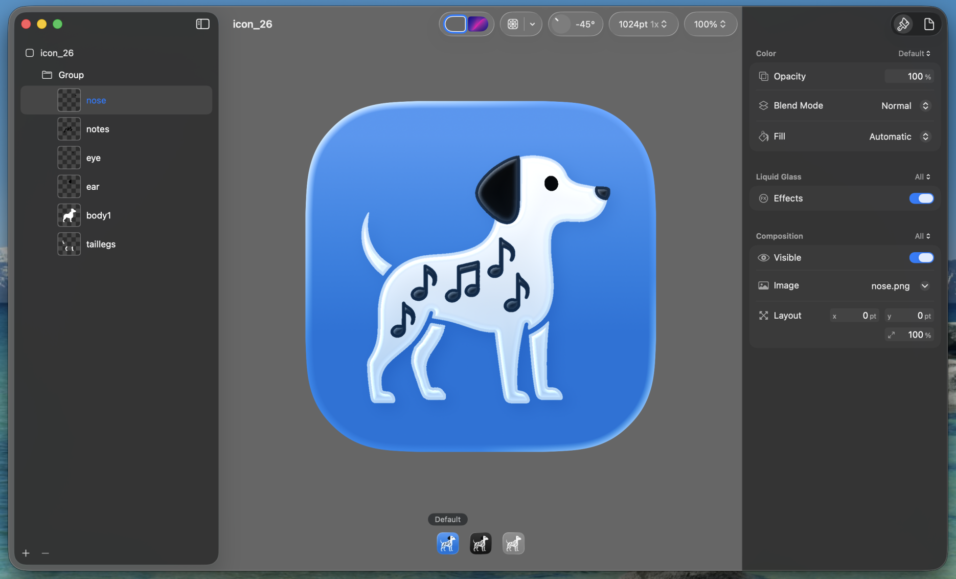
I was able to make both of these icons myself by first prompting ChatGPT for basic outlines of the images I was wanting. I then took the images into Acorn and broke them apart into the distinct pieces I needed while tweaking them slightly to work as app icons. Then I just moved all the layers to Icon Composer and played with the different effects until I found something I liked!
I’m not sure either of these icons are in their final states yet, but they are more examples of something I couldn’t have achieved on my own without this new tool from Apple!
